A note from the University of Adelaide's Careers Service
Don't forget that we offer heaps of workshops to help you update your resume! Check out our events here, which run throughout the semester and study breaks.
You can also use our online learning modules on MyUni, which include Resume and Cover Letter Writing, Interview Skills, connecting with employers, and more! Request access to the modules here.
--
Job seekers, give yourself an edge with some modern touches.
“In today’s job market, your resume needs to immediately stand out,” says Dawn Bugni, a professional resume writer in Wilmington, N.C. Attention spans are at an all-time short, with hiring managers spending just six seconds looking at a resume before deciding whether the applicant is worth further consideration, a recent study by TheLadders found. (That’s if a human looks at it at all; before your application even reaches a hiring manager, it usually has to make it past an automated applicant tracking system.)
As hiring continues to increase, job seekers will face stiff competition this year. Follow the tips below to make your resume shine in 2016.
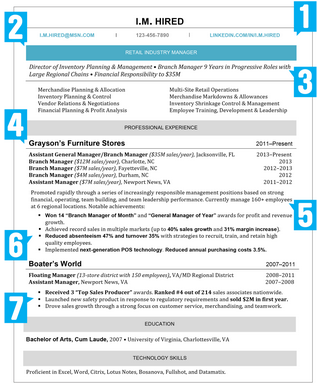
Click on the image to expand it, or read on!
1. Enhance your contact information.
Put simply: hiring managers are busy; make their job easier by hyperlinking your email address so that you’re only one click away, says Wendy Enelow, co-author of Modernize Your Resume: Get Noticed…Get Hired. Bear in mind that you expose yourself to identify theft if you include your full mailing address, says Enelow, so only put your city, state, and zip code on your resume. Also, use active links to your LinkedIn profile and any other social media accounts that are fit for recruiters.
2. Make the page “pop.”
Depending on the industry, you can distinguish your resume by punching up the design, but exercise caution: a graphic artist, for example, has more creative leeway than an accountant.
Enelow’s co-author Louise Kursmark recommends using color to make your resume unique. To stay professional, consider making only section headers blue, for example, and leaving the rest in black, Kursmark suggests. And replace the outdated Times New Roman with a more modern font such as Cambria, Calibri, or Georgia, Enelow says. (As standard typefaces, they translate well between operating systems.)
3. Ditch the objective statement…
Today’s hiring managers aren’t concerned with what is it you’re looking for—they’re focused on finding the right hire. Thus, “the objective statement has become obsolete,” says Tiffani Murray, an HR professional and resume writer at Atlanta-based Personality On a Page.
…and lead with a summary.
To capture the hiring manager’s attention, start your resume with a short professional synopsis that states your years of experience, job history, and big career achievements. Instead of labeling the section a “summary,” use the header to highlight your area of expertise, says Enelow.
4. Guide the reader’s eye.
The Internet has changed reading behavior, says Kursmark: “People don’t read top to bottom anymore. They’re constantly skimming and looking at different parts of the page, and if you don’t structure your resume to appeal to that, a lot of good material will get overlooked.” Therefore, use bolded text to ensure your achievements stand out.
5. Beat the robots.
Many medium and large companies use software to weed out candidates. Your resume will need the right keywords to get through, so mirror the language of the job posting, advises Bugni, and pay attention to detail. “Changing something as simple as ‘customer service’ to ‘client relations’ can get your resume approved or rejected,” she says.
6. Forgo a “skills” section.
Weave your talents into your work experience. “Employers are looking for more than a list of skills,” says Murray. “They want to know how you’ve applied them.” The exception: It’s beneficial to have a designated section when applying for a skills-based job that requires specific qualifications, such as an IT specialist.
7. Maximize your real estate.
Despite what you may have heard, you don’t necessarily need to limit your resume to one page. “A resume is as long as it needs to be to convey value. And not one word more,” says Bugni. That said, a two-page resume may be appropriate for someone with 30 years’ experience—not for a recent college graduate. To conserve space use bullet points, active verbs, and industry-specific acronyms, and don’t state the obvious (e.g., including “references available upon request”).


